I'm Ba-aaack!

Hi Gang! Woohoo!!!! Happy School Year, Y'all!!! I'm so completely excited to be back posting again! I hope you had a wonderful summer and are ready to get back in the swing of the new school year. I think I can speak for most working moms and say that summer (though at times, super fun...) can be a BEAR, so I for one am ready to get back to it!

It has been an unusually busy summer for the Pankoniens, but with the start of the new school year, I feel everything is finallly getting back to normal. So-where the heck have I been? Baseball tournaments, selling my house and moving to a temporary apartment...on the same day that my Lindy lost her two front permanent teeth and had to have them re-bonded (seriously?!), more baseball tournmaments (all the way to State...woohoo!), moving into NEW office space (yet another woohoo!!), buying new house, planning "teeny-tiny" cosmetic remodel of new house, oh...and throw in lots of client projects and Ben in a cast...and I'm super spent!

But, as much as I've missed blogging and sharing with y'all, never fear!, my wheels have been spinning with lots of fun ideas that I'm ready to incorporate into client projects -- as well as my own new projects! I am literally in LOVE with soooo many things right now that I just had to post the top 10 of what I'm obsessed with right now. I think I could have done a whole top 10 on just lighting though...first thing I think about as soon as I plan construction for my own remodels is lighting!! And, stay tuned for my next posts on "Catalog Top 10" and what The Pankonien Group is doing NEXT!
Top 10 82712
1.  Zig zag rugs!!  Madeleine Weinrib brought back the design years ago and now they're available through a variety of vendors at every price point so we can all try out the trend.  In a kids gameroom or bedroom? Or your office?  A fun way to add pattern.
2.  I'm loving this vignette...China Seas wallpaper with vintage modern mirror (this is a reproduction from one of my favorite vendors!) and so cool buffet. 
3.  Modern light!  This one from Kartell is a pretty good price (under $300!) and  would add that unique touch to a variety of spaces.  Comes in a bunch of fun colors.
4.  Bertoia chair...this has been one of my faves for quite a while.  How cool would these be with a really rustic farm table.  Love that contrast of textures!  Can't wait to use these in my new breakfast room! :)
5.  Marble tile (or any tile!) in a herringbone pattern!  Perfect for a kitchen backsplash or the floor in a master bath.  I recently tiled a kitchen range wall in a herringbone pattern (to be featured soon on the blog!) and LOVE how it turned out.
6.  Remember me??...coral everything!!
7.  How awesome would these be around the the new "conference" table in my office.  Would love to stumble upon this set of vintage chairs!
8.  So, speaking of my breakfast room (see #4)...I can't wait to add banquette seating all over the place in my new house!  Along with adding architectural appeal, I just love banquettes because they make a room so cozy and fun to hang in.  The perfect way to get your party guests to step awayyy from the kitchen island.
9.  Pillow from Dwell Studio.  Love Ikat (always!) and super love chartreuse and gray. :)
And...drum roll please...
10.  This awesome pendant (as part of a pair) will be the highlight of my new kitchen.  The brass and the bronze are amazing!!!

Let me know what you're loving right now!  Hope you have a great week!

Before and After Friday - Chairs and Sofas!


Hey gang!  I took a little break last week, but I'm back with a little twist on our "before and after" theme.  I thought it would be fun to feature something we can each do in our own home, even if we don't have the budget to change an entire room from top-to-bottom.

Often when I come in to redecorate a space, the client has a couple of existing pieces in the room that I need to incorporate into the design.  Very rarely do I have the opportunity to come in and start from scratch with every item of furniture.  And, frankly, I prefer to work with some of the client's existing pieces, especially when the item has sentimental value for my client and their family!  In the best circumstances, it adds history to a room...maybe it was grandmother's old chair.  But, most importantly, it can add soul to the space.  It helps all of the other new, "perfect" pieces in the room come together in a not-so-perfect way.  I like that.

When considering upholstered furniture, many of my clients ask me if it’s "worth it" to recover the piece or if they should just go ahead and order a new sofa or chair. The true answer is yes, it can save some money...sometimes clients can save a few hundred dollars if a piece works in their room and it’s a well-made piece (ask a professional!). If it’s both of these things—a good fit and a good make—then it’s absolutely worth it!

Take a look at these "existing" pieces that we transformed to fit into our new design.

Before -- the classic definition of grandmother's furniture.  A beautiful Regency-style dining table with the double pedestal base that I desperately wanted to work into the design of this dining room.  Not so sure about the chairs.  We didn't want matchy-matchy with the table but it was a risk to figure out what to do with that wood...epiphany!  Let's make it look like those reclaimed pieces that I'm so crazy about right now!  Refinisher gets two-thumbs up for this amazing work!!


After -- We stripped the chair, did a few more "mystery" techniques, and reupholstered in a classic linen with spaced nailhead trim for the side chairs and a gorgeous cut velvet in charcoal and brown for the arm chairs.  Seeing this gorgeous room when you enter the home sets the tone for the rest of the space.


Before -- 1960s Danish Modern sofa.  Search on ebay and you'll find a million pieces just like this.  Sculptural.  Unique.  So much potential.  But how should we reupholster it??  You have to pick a fabric (or fabrics!) that does this piece justice.  No classic linen here.  BORING.  This is my mother-in-law's piece (she has cool taste, right?!).  She found this in a Dallas consignment store for a great price so she wanted to splurge on top-of-the-line cut velvets...


After -- Designer's Guild, here we go!  We had so much fun putting these fabrics together!  We splurged quite a bit on the patterns and decided on a solid antique chenille for the long seat cushion.


Before -- Ooooh, the client and I struggled with this one.  Kinda frumpy.  Can we make this into the tailored piece that we want for the space?  In the end, the sofa was in good structural condition, had the proportions we needed and budget won out.  Apples to apples, it would have cost $1,000 more (with freight, etc.) to order a similar sofa in same fabric new.


After -- Woohoo!  Check me out!  Betcha weren't expecting this sofa could pull it together and look THIS dignified!!  In a crisp, family-friendly fabric, add nailhead trim, restructured back pillows, one long structured sofa seat and tailored waterfall skirt...and she is stylin'!


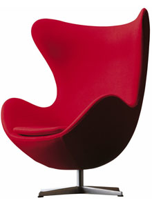
Before -- ok, so I'm going to cheat a little here.  This is not a used chair (but it could be!  this is the classic Arnes Jacobsen modern "egg" chair from the 1950s).  And this was a budget buster.  Oh, baby.  All in, the chair cost the same as the store-bought sectional sofa in this space.  But this is a perfect example of how one piece of furniture can truly make the room, and the lovely bachelor who I decorated for embraced the vision.  Bless him!

Chair looked just like this when we received it from the vendor.  But, we wanted a pattern!!  And the chair is not available in a pattern!!


After -- Ok, seriously?!  Ask my bachelor client how many compliments he gets on this chair.  A) that Velvet baby hex fabric looks A-MAZING on that chair and B) no one else has a piece just like this and that makes it sooo special.


 Hope this inspired you to use a piece you already own to create something unique in your own home!


XXOO, LP


Before and After Friday!!

Wow! I am so touched by all of the sweet words of encouragement that I have received about the new blog.  Like I mentioned in the "debut," finding the time to write a blog is a HUGE departure for me, but I have found that it is an unexpected highlight of my week!  I love sharing my projects (and thoughts on design!), especially since receiving your generous feedback.  Thank you guys for making it fun for me!

So, here's an idea...how about we have a "theme" day?  I LOVE a good "before and after" and what I'm hearing from you is that you overwhelmingly do, too.  "Before and After Friday" it is!

Since I've been teasing you with this project since my first blog post, I'll start with this "Santa Barbara-style with a modern twist" kitchen, dining and main living space that I completed this spring.  A little bit of background -- this project is in Austin.  A mid-2000 "Tuscan-style" home.  Many of us in west Austin, especially, are very familiar with this look -- it is often rich with heavy architectural details (stonework, dark wood beams, stained cabinetry, faux finished walls) that were based on some of the gorgeous historic architecture of the Tuscany region of Italy, but maybe a little overdone in ATX.

These lovely clients wished to lighten up and add a touch of modern to these spaces without throwing the baby out with the bath water, so to speak.  I was up for the challenge!

Using my love of Santa Barbara, California style (heavy Spanish architectural details, beams and handmade tiles contrasted with white venetian plaster walls) as an inspiration, as well as my young, fun, client family's love of young, fun and modern, we embarked on the redo...


BEFORE:  In the original kitchen, the faux-finished walls and honey-colored cabinetry practically hid the high-end appliances and beautiful hand-crafted tiles on the backsplash. 
BEFORE:  Heavy architectural features and richly-colored furnishings.  Distracting in this large, open space.  Client was ready for a change!
BEFORE:  Faux-finished walls, iron railing, dark oriental-patterned carpet.  Do we change the railing, demo the entire house? Move??  ;) No, no...let's start with changing the carpet and paint...and some fresh decorating.


And, drum-roll, please....the "AFTERs," in reverse order...

Photo credit:  JanaMcKelveyPhotography.com. 

AFTER!  The entry freshened up with seagrass carpet and stair runner, Benjamin Moore Lancaster Whitewash walls and trim.  It's not your granny's table skirt...best way to update any table!  Fabric is a Lee Jofa embroidered geometric.


AFTER!  Large sectional in family-friendly fabric fits the whole gang. Reclaimed wood side table adds to the mix and works with Client's existing copper and wrought iron table.  Kelly Wearstler fabric on Lee Industries swivel chair.  See more photos of this project by clicking on the "Portfolio" tab at the top of this page.


AFTER! The kitchen...ahhhh.  The tile stayed, the granite stayed, even the cabinet pulls stayed!  But, oh, what a difference paint and some key accessories can make!  Benjamin Moore White Dove (my absolute fave) on cabinets.  Visual Comfort pendant lights, burlap and hand-rubbed black counter stools.  Beyond gorgeous zig-zag linen fabric finishes the room on the roman shade.  I love that the kitchen feels brand new but not a bit cookie cutter.


Love this project!  One of my faves!  Thank you sweet clients for allowing me to share!  :)  XXOO, LP


Crazy for Coral!

Design incorporates tons of elements (space, balance, texture, etc.), but one of the most obvious to any eye is color! Lucky for us, the company Pantone was born and now, as the world renowned authority on color, sets the forecast for many of the trend-setting shades.

This year’s Pantone Color of the Year, however, didn’t take long to catch on at all!  For those of you fellow “shelter” magazine junkies, you may have noticed the constant publicity that the 2012 Pantone color, Tangerine Tango, has received.  And it's easy to see why.  It is a vibrant, rich coral color that we can’t get enough of! 

I’ve been antsy to use coral in a client space for months! So much so that it inspired a recent super-of-the-moment addition to a client bedroom. We created a soothing space for this client with Benjamin Moore Monterrey White walls and trim, white linen drapery, and neutral bed linens. We added a pop with gilded accents and the charcoal Greek key fabric (Schumacher’s Nebaha Embroidery) which features the Greek key pattern uniquely run on the bias) – on the bed’s only patterned pillow and as a trim on the drapery.

Well, the design took an interesting turn when I decided to add just a "little" splash of color to the room. One of my all-time favorite color combinations is charcoal gray and coral. Perfect for this space. So! We painted an existing dull-brown dresser with a custom coral color, using a special catalytic paint usually reserved for automotive use, but now seen more and more as a furniture application. Add new polished nickel pulls and ta-da! A young, fun, yet calming master bedroom!


Love that Worlds Away chandelier! Schumacher's Nebaha Embroidery fabric used on pillow and as trim on creamy linen drapery. Gilded coral prints above the bed help pull it all together.

A peak of the coral dresser.  Makes me giddy!!!

Here it is in all its glory!  Great pinky coral color...still LOVE.  Polished nickel pulls.

And, I’m not the only one…I'm loving the unique ways these designers have used coral below.

Pantone's Tangerine Tango -- the color inspiration

Source unknown.  I'm bananas over that wallpaper.  Just goes to show you can have a totally gorgeous neutral space and add a "little" oomph to make it special.


Source unknown.  This room is just too awesome.  Would love to do a space like this someday!  So, a fun family den with light gray walls and coral trimwork??  Killer.  What is that light fixture?  love, love.
Source unknown.  Love the mixing of elements here. Grandmother's Regency dining table with painted and reupholstered (coral print!) chairs and a beautiful painted wallpaper.  Gorgeous!

Which is your favorite use of coral?


Blog Debut!


As many of you already know, my interior design business, The Pankonien Group, has kept me very busy lately!  With two kids and a super supportive husband to keep up with, designing the structure and furnishing of my own homes through the years has allowed me to delight in my passion. Renovating and reorganizing my homes to best suit my family’s changing needs was something I soon realized came naturally to me.  I renovated my first home in 2000, and in 2004 I built my first custom home. It was through these experiences I truly knew this hobby could blossom into a fun career and creative outlet for me!  I've been so blessed the last several years, as my business is steadily growing and my client list has expanded way beyond my expectations. My new blog will showcase some of my past work, as well as regularly update my friends, family and client base on current projects and my favorite products and inspirations!
This is just a sampling of my most recent projects!  Click on the Portfolio tab to see more pics!
Check me out on houzz.com also!

photo credit:  JanaMcKelveyPhotography.com

Coming Soon!  The "Before and After" of this great Santa Barbara-style kitchen!
Beautiful Westlake-area home.  Check out the rest of the pics on houzz.com!

Lovely home gets traditional...with a twist! More pics in portfolio section.
This gorgeous home was "Tuscan" style...now, transformed!

Welcome!

Welcome to the new blog for The Pankonien Group, Inc. Stay tuned for updates...